dEADLINE
Finalize the brand name, logo, and concept. Launch SNS (~4.30)
Decide on product categories and begin designing (~5.31)
Complete all designs and 3D print everything (~6.30)
Sign the workshop contract.
Register the business.
Finalize all products (~7.31)
LAUNCHING OUR BRAND. (8.30)
tHOUGHTS
The design process finished faster than I expected.
I think even the 3D printing will be completed within May.
That means I have more time than I thought.
But just because I’m moving quickly doesn’t mean I’ll shorten the overall schedule.
Now it’s time to start looking into rubber molding manufacturers.
If things go well, the final products might even be ready by June.
Beyond that, I need to build the website.
If everything moves smoothly, maybe we could launch in early August.
pRODUCTS
Earrings: Orange
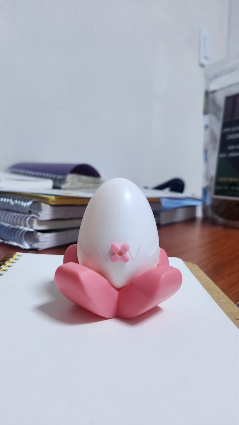
Rings: Orange, Croissant, Egg
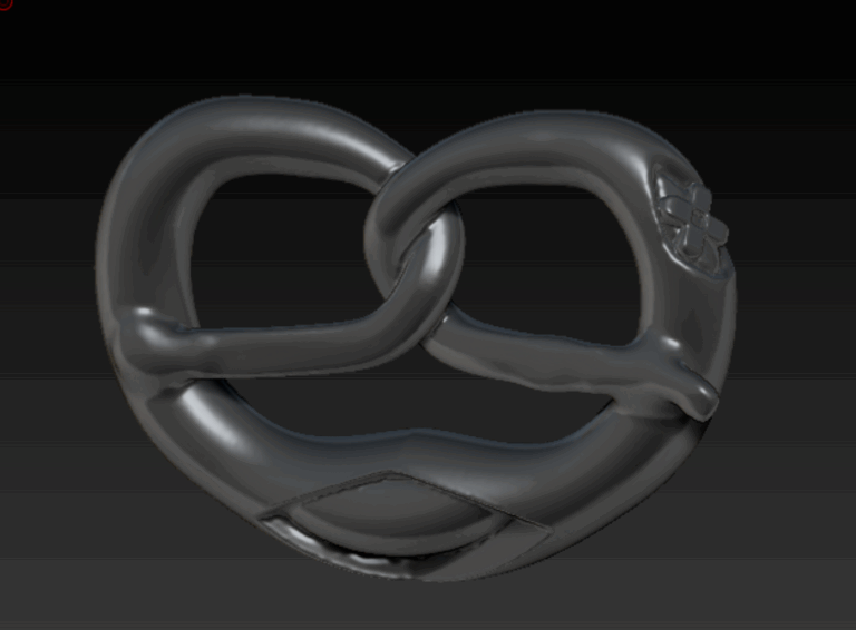
Necklaces: Meat, Orange, Pretzel, Pizza
I want to add earrings. What would look good?
Personally, I have an idea inspired by an egg,
but commercially, it doesn’t seem very appealing.
Should I just make it for fun?
-1-
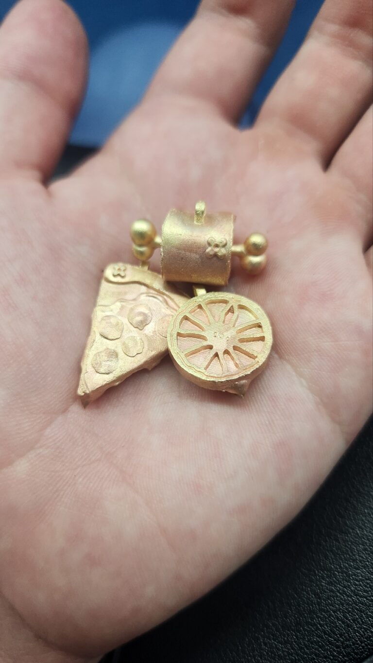
My first design is a pizza. Sorry for the phone camera.
You can already see that it looks suck.
-2-
I wanted the cheese to cover the crust a bit more.
My friend wanted the cheese to look like it was melting and dripping down one side.
I kept sketching over and over.
Later, he mentioned that if something like saliva or liquid got into the small gaps during production,
it might be hard to clean out.
While working on it, the file got corrupted and I had to start from scratch.
The final result is the third pizza design.
-3-
I’ve gotten a bit more comfortable with ZBrush, and I finally finished it.
We just need to add our bandage detail to make it cuter,
and I’m thinking we could also make a smaller version as earrings.
It might be nice to add a highlight to the pepperoni using epoxy.
Now all that’s left is to print it with the 3D printer and refine the details, and then it’ll be done.
While I was thinking about what to create,
someone I know mentioned the cartoon-style meat you often see in animation,
so I immediately started designing it.
I wanted the end of the bone to be shaped like a heart,
and I also considered adding some cuts or scars to the meat for extra detail,
but I gave up on that idea to keep it cute.
During post-processing,
I’m planning to add some damage texture to the bone to give it more detail.
This piece was actually pretty easy to make,
and although the bone part was slightly tricky,
it didn’t take very long overall.
Without our bandage logo it might look ordinary,
but once it’s added, it definitely boosts the cuteness.
It feels like a very common reference.
How can we add our own identity to it?
Instead of making the yolk a simple, perfectly round shape in a fixed size,
I added details in a different way.
The recessed areas are where epoxy will go.
I’m also thinking of adding epoxy to the shell part to give it more orange color,
but I’m not sure if that’s possible.
I think I need to discuss it with my friend.
It might turn out better than I expect.
This piece took less than an hour to make.
I designed the ring in a signet style,
but… is there a more unconventional shape?
It feels too common and predictable. It’s not interesting.
The downside is…
- I couldn’t add enough detail to the shell.
- I can’t seem to find the balance between kitsch and fancy.
- It’s a signet ring with a shape that’s too ordinary.
- It doesn’t feel special at all.
Result
It’s not kitschy. It’s not fancy either.
And it’s not even somewhere in between.
It’s just… average.
Maybe that’s exactly why it could sell well.
But if I were running this brand alone,
I wouldn’t choose to make this kind of desi
-1-
Every time I smoked, I kept thinking about how to make a fried egg look kitsch.
Then, while looking at different products,
I suddenly remembered seeing a design of a croissant pierced with a fork.
In that moment, the idea hit me —
what if I turned a frying pan into a ring and placed a fried egg on top?
It went straight through my head, and I immediately started working on it.
It took less than an hour, and I liked it.
But the problem is this:
how do I clearly and beautifully separate the egg white from the frying pan?
I still don’t have the answer.
Simply adding thickness to the egg white feels too boring.
As for the yolk, I strongly want to use a pavé setting.
But placing one large yellow gemstone might move it away from a refined, luxurious mood.
At the same time, it would definitely enhance the kitsch aspect.
I want to find that middle point —
somewhere between kitsch and fancy.
The downside is..
- No matter how much I think about it,
the pavé setting still feels like a missed opportunity…
That would’ve been the true masterpiece. - I couldn’t express the egg white in a way that feels both cute and fancy
Result
- Overall, it’s a fun design, and I’m satisfied with it.
- But still… aside from not using the pavé setting, I’m personally satisfied.
This is the croissant that brought me pain.
It hurt me a lot, but at the same time, I’m grateful to it —
it pushed my CAD skills up a level.
I thought it would be easy.
But creating clean curves while also forming soft,
step-like side lines was harder than I expected.
I also knew, even before I started,
that it might end up looking like a caterpillar — and that bothered me a lot.
It needed detail.
When I searched online, all I could find were twisted rings.
None of them really looked like a croissant.
There wasn’t enough detail.
Still, I started.
You just have to begin. It’s better to try and fail than to avoid something
because it’s complicated or gives you a headache.
-1-
It came out looking completely like a crustacean.
I thought maybe if I built a basic inner structure and layered something over it,
it might work.
So I used BEND and forced each segment into shape, one by one.
What came out was something grotesque. A complete failure.
When I looked at real croissants, I noticed those rounded lines along the surface,
so I tried adding those as details too.
It just became an even more perfect crustacean.
-2-
It looked cute, but the lines weren’t clearly defined, and it wasn’t smooth.
And again — it looked like a caterpillar.
There was no real detail.
But this version became the foundation for the final form.
The reason I didn’t like it was simple.
It looked curved and soft, but I hated the dividing lines that separated the forms.
I wanted it completely smooth — no visible segmentation.
I wanted it to feel like something gently layered on top.
My friend was satisfied. Said it was enough.
But it wasn’t enough for me.
If I were going to do it half-heartedly, I wouldn’t have started at all.
Staring at it longer doesn’t suddenly make things better or produce ideas.
So I decided to pause until Saturday.
Every time I smoked, I thought about solutions.
I kept sketching the image in my head.
-3-
Finally, I completed it.
From Saturday morning, I spent three to four hours finishing it.
I adjusted all the proportions.
I gathered every idea and method that had come to me over the past few days.
I created a seamless curve with no harsh lines.
I achieved the layered feeling I wanted.
And I placed the rounded details in a way that felt clean and cute.
I broke through a limit.
Still, this is only beginner level.
The image in my head hasn’t been fully realized yet.
But for now, I’m satisfied.
The downside is..
What if I use epoxy to add color?
If I make the layered part brown, it could feel much more like a croissant.- Maybe I could achieve cleaner lines and a more refined shape.
Result
- Overall, I’m satisfied,
but I think I’ll only know for sure once it’s printed along with the pizza piece and comes out in silver.
I looked at many products, but they all felt the same — boring and repetitive.
Just like with music,
I’ve always believed that if I’m going to do the same thing as everyone else,
it’s better not to do it at all.
Since we’re working in silver, we needed something even more differentiated.
If you call something a pretzel,
why does it always end up being the same small heart shape,
either tiny or made to “look” luxurious?
So I decided to use a German pretzel as my reference.
When I studied the references,
I noticed the split areas at the bottom and the cracks along the surface.
I wanted to use those as details.
Not only that — when I looked at the overall heart-like shape,
I started to see something like a smile.
The cracked bottom part even looked like a mouth and a tongue.
The reason I kept the back section straight after the twist was also to emphasize that smile.
The twisted middle section gave me some trouble,
but somehow it came out the way I envisioned it.
I’m satisfied.
The downside is..
- Maybe it would’ve been better if it had more of a “smiling eyes” expression.
- The inside of the cracked area feels too smooth.
Maybe it would’ve looked better if I had given it a bread-like texture.
Result
Overall, aside from a few things I wish I had done differently, I’m satisfied.
I guess I’ll only know for sure once it comes out.
mY tHOUGHTS uNTIL nOW
The sudden decision in April, returning to Korea, and now preparing for this business.
Everything is moving in directions I never expected.
More precisely, I could say my life began to change entirely around September 2022.
I did music for five years, starting in 2017.
There was a lot of frustration and depression during that time.
When I decided to let go of music and “try a new path,” I set my sights on fashion.
As I explored different options, I came across an opportunity to go to LA.
I wrote my personal statement exceptionally well —
well enough that the person in charge contacted me directly.
I dreamed about it, but I was rejected at the visa interview.
Well… trying to pass one of the toughest visas with only a short period of English study —
that took some nerve.
But that moment became a turning point.
For the first time, I felt, “Maybe I can do this.” “If I’m sincere, it goes through.”
Somehow, I applied for a working holiday in Canada.
I even considered permanent residency there.
But things got blocked.
So I started a business in Vancouver, thinking I could use that as a pathway to residency.
That, too, fell through.
And somehow, I’ve ended up here.
Life really gives you no preview of what’s ahead.
Maybe I just really don’t like working under someone.
Even now, it’s not so much confidence that “this will succeed.”
It’s more that I feel satisfied simply doing something that’s mine.
I think I’ll truly feel the excitement once the physical products come out.
Right now, they only exist in 3D.
They’re not tangible yet.
Maybe once my ideas become real — once I can hold them —
that’s when I’ll really feel the thrill and want to create even more.
For now, this is what’s placed in front of me.
There’s no rush. I can move forward slowly.
e99 is only a means.
A tool to grow myself. A step toward building a brand that is entirely mine.
So even if I feel like I’m carrying everything alone,
right now, I’m still in a season of learning.
God will lead the way.
I just need to stop being afraid — and do it.
wHAT'S mY nEXT sTEP?
Refine earrings.
Master 3D printing.
Secure manufacturing.
Formalize the business.
Protect the brand.
Build the platform.
e99 eND
e99 sTEP o5
e99 sTEP o4